Stay Updated With our Latest Insights
Explore our blog for helpful tips, web design trends, SEO advice, and success stories to help your business thrive online.

Tired of paying for useless clicks? Learn why Google Ads is so expensive in NZ, how Smart Campaigns waste your budget, and how to fix it with local management.

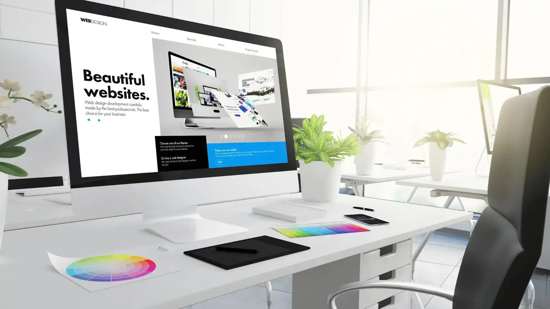
Looking for a budget-friendly website in Christchurch? We create stunning, responsive web designs that won’t break your budget. Contact us today!

Has your web designer vanished? You are not alone. We explain why freelancers 'ghost' clients and how the subscription model protects your business.

Thinking of building your own website? We compare the real costs of DIY platforms like Wix vs professional web design in NZ. Read the 2026 guide.
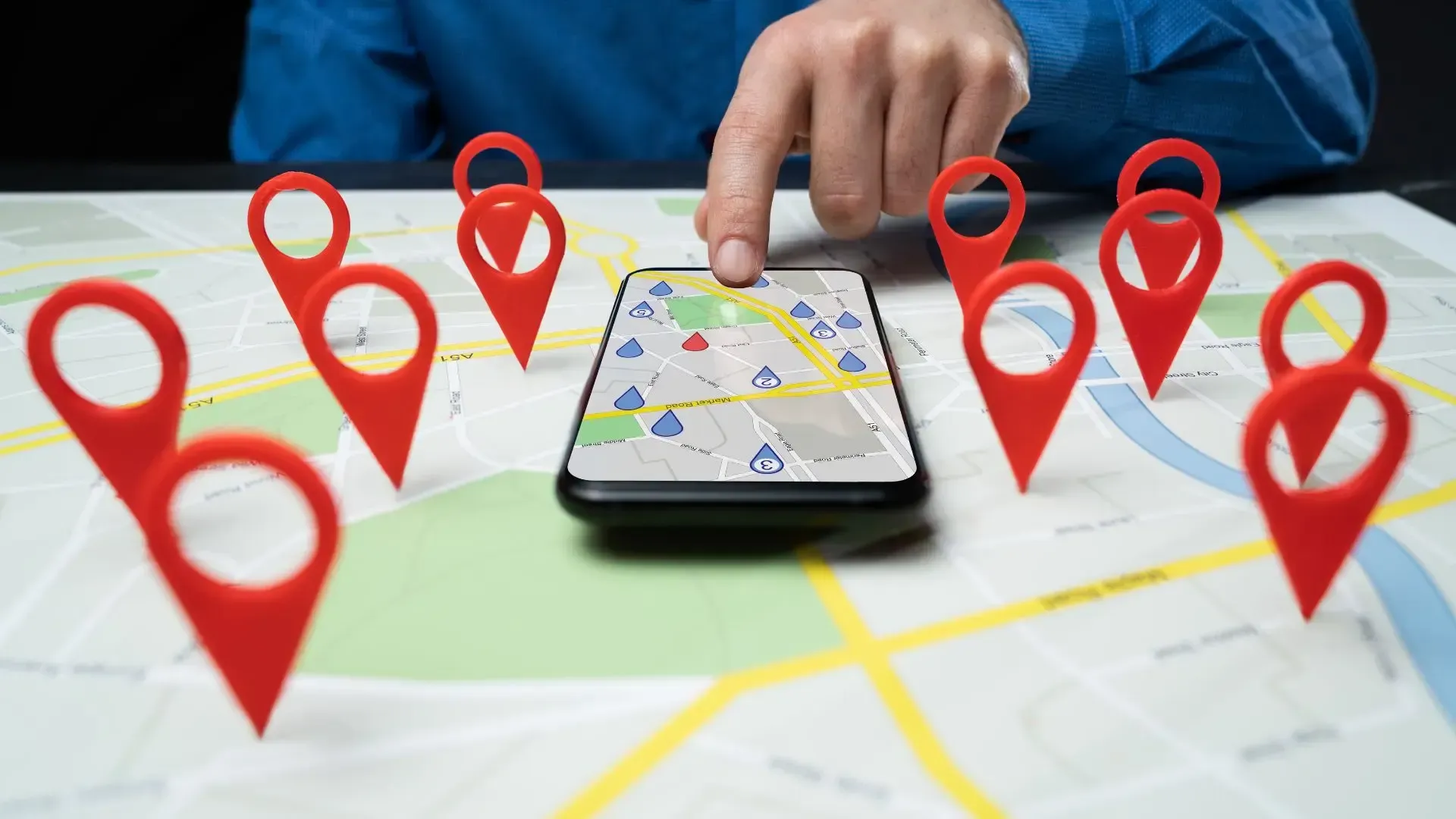
Want to rank #1 on Google Maps? We share 5 proven Local SEO tips for Christchurch businesses to get found, get reviews, and get more leads in 2026.

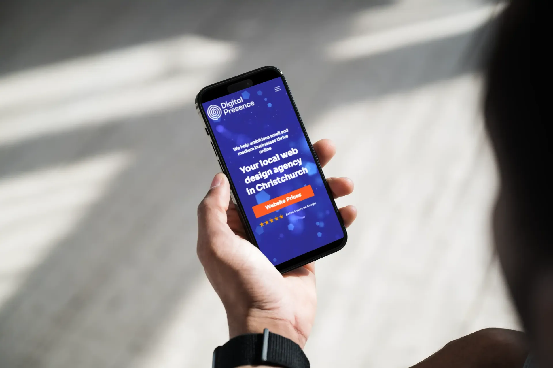
Is your business invisible online? We explain what a digital presence actually is (including AI search) and give you 7 ways to boost yours in 2026

Confused by web design prices? We break down the real cost of a website in NZ for 2026—from DIY and freelancers to agencies and subscription plans.

Is it better to buy a website upfront or pay monthly? We break down the real math behind web design costs in NZ to help you save your cash flow.

Learn the key elements that make a website effective, from structure to design, and how each part works together to boost user experience and performance.

Explore how Digital Presence builds websites designed for the future of AI search, combining speed, modern design, SEO, and LMS.txt optimisation.

Learn how to balance site speed and design for better UX and SEO. Boost rankings by optimising performance without sacrificing look and feel.
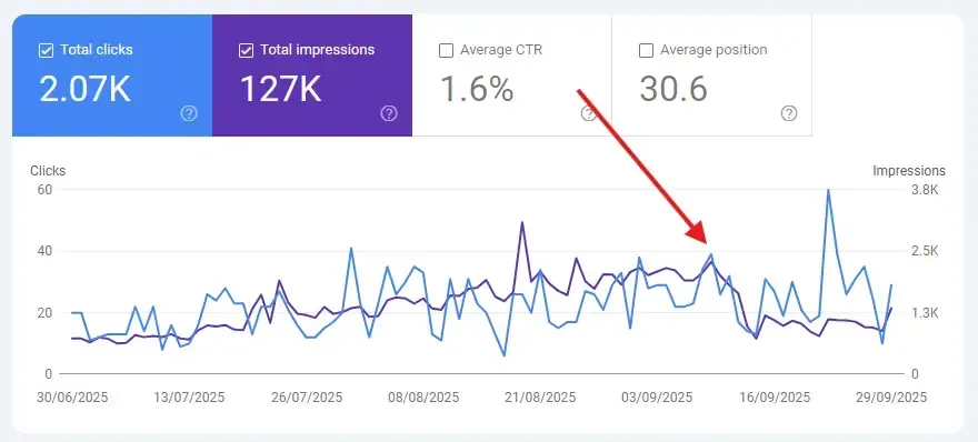
Wondering why your google search console traffic dropped? Learn key reasons, what it means for small businesses, and how to fix performance issues.

Discover 5 key ways web design boosts SEO, from mobile responsiveness and fast load times to smart sitemaps and user-friendly navigation for higher rankings.

Discover how AI is reshaping the search landscape and what it means for your small business in Christchurch. Stay ahead with smart digital strategies.

Struggling with bounce rate? Discover how strategic web design can keep visitors engaged, increase conversions, and boost your site's performance.

Low-cost websites may seem smart, but they often fail in SEO, user experience, and performance, costing you more in the long run. Find out why.

Learn simple, effective ways to optimise your website for higher search rankings. No technical skills needed. Boost your visibility today!

Learn the key best practices for accessible web designs to ensure your website is usable for all. Enhance user experience & meet accessibility standards.

Master the art of designing a website for lead generation. Boost your service-based business with a user-friendly, conversion-focused design strategy.

Boost your local search rankings with website design. Learn key strategies like mobile optimisation, structured data, and user-friendly layouts.

Learn how to leverage Google Ads to effectively attract local customers in Christchurch, boost your visibility, and drive sales with targeted campaigns.

Get expert insights on launching a new website design. Follow best practices to maintain SEO rankings, improve performance, and engage your audience.

It's important to know how well each page performs because it helps you to identify which content needs to be improved, updated or even removed. Read more!
Discover your dream website design with our free homepage mock-up service. See your ideas come to life without any commitment. Get started today!

Click happens! These 7 web design mistakes could be driving customers away. Learn how to optimise your site for better user experience & sales.

Outdated web design can hurt your business. Learn how modern, pixel-perfect design enhances user experience, SEO, and conversions. Contact us now!

Redesign your website in 2025 to reboot your business. Achieve a fresh, modern look that drives growth for your business. Visit us to engages your audience.
Discover how exceptional web design can transform your business. Learn tips to improve user experience, boost conversions, and drive growth today!

Learn how to optimise your website design for higher sales. Discover key strategies to enhance user experience and drive conversions on your site today.

Explore our latest website design updates for Christmas! Discover festive trends and tips to elevate your online presence and engage your audience.

Learn how Google’s mobile update can impact your site. Stay compliant or risk losing rankings. Mobile optimisation tips & best practices inside.

Learn proven strategies to optimise Google Ads for higher conversions. Master the art of customer acquisition with expert tips and insights. Learn more!

Discover sustainable web design practices with Digital Presence. Reduce your website's carbon footprint while enhancing SEO and user experience.

Learn why organic website traffic is essential for your online success. Find us how we can help boost your website's visibility with effective SEO strategies!
Is your website struggling to convert visitors into customers? Discover how a website redesign can help improve your conversion rate. Learn more now!
Ensure your website survives Google's latest updates with these essential SEO tips. Learn how to protect your site and maintain high rankings.

Many business owners approach their website purely as an online brochure for their business; however, web design is more than a display of services. Read!

Days of designing a website solely for desktops are long gone. Responsive web design is the foundation of your digital presence & marketing strategies.

The crucial role that website design plays in SEO success is often overshadowed by the quest for the latest SEO tips and techniques. Find out more!

Enhance your website's performance in SERPs with proper keyword optimisation. Gain valuable SEO insights to optimize your content for maximum visibility.

Our mission is to provide awesome web design solutions for our clients. Let's explore why we prefer Duda and how it can benefit your business.

Learn powerful Google Ads strategies to boost ROI! Expert tips from Digital Presence NZ. Maximize clicks and conversions. Start optimizing today.

Tired of being ghosted by Google My Business? Discover how a fresh website design can boost your online visibility and attract more customers today.
Discover the power of subscription websites! Unlock digital success with an enhanced online presence. Explore advantages for sustainable growth. Learn more!
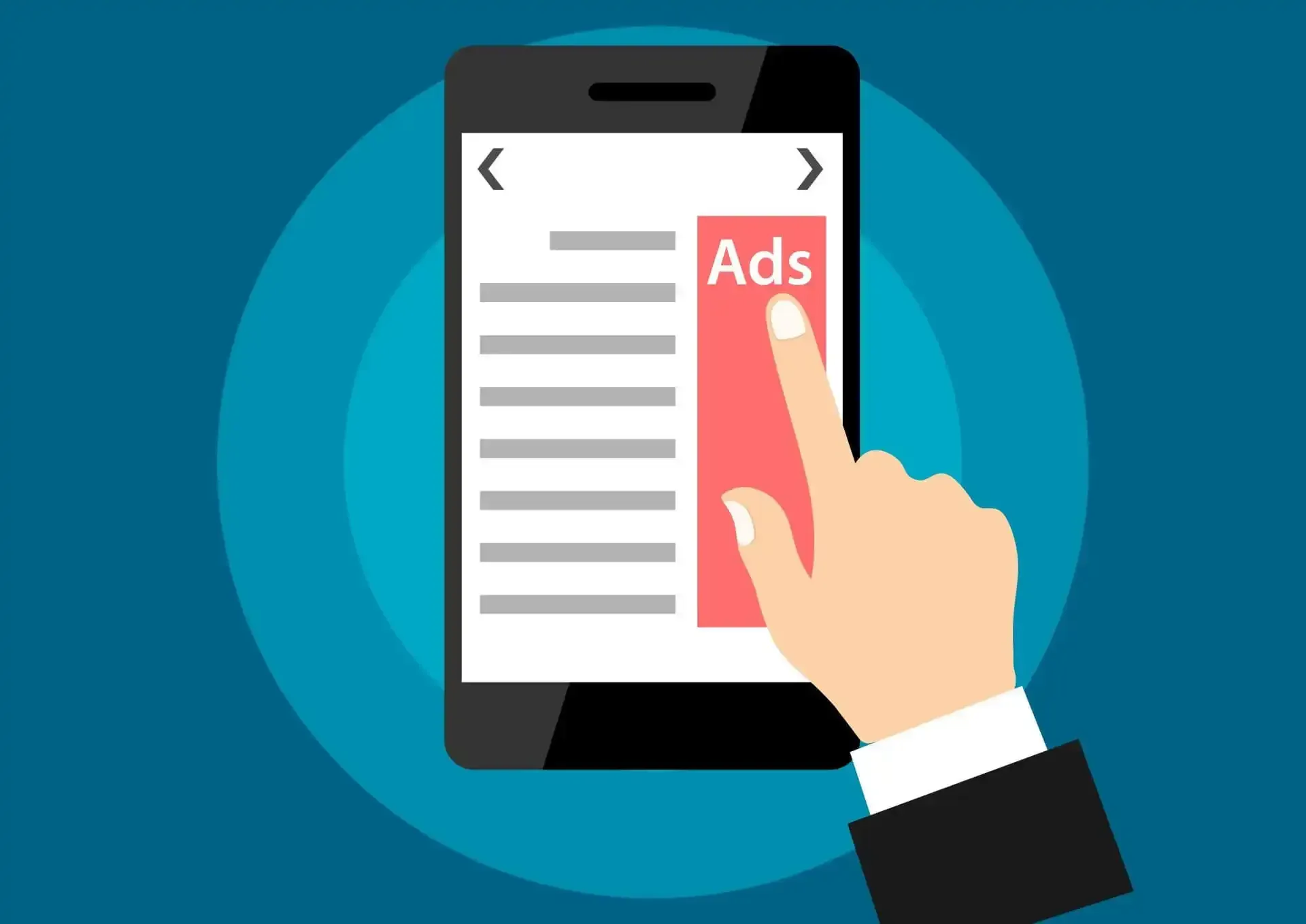
Google AdWords search ads & Google Display Network display ads are the most effective tools for marketers to create a successful PPC campaign! Read now!

Elevate your local SEO strategy with dedicated service pages. Learn how to boost visibility and attract more customers. Contact Digital Presence today!

Unlock the power of Google Ads with our beginner's guide tailored for small and medium business owners. Expert tips and strategies await! Start now.

Elevate your website's success with expert insights on crafting powerful CTAs. Maximise engagement, boost CTR, and convert visitors into loyal customers.

Elevate your website's success with expert insights on optimising speed and mastering Google's Core Web Vitals. Stay ahead & enhance the user experience now!
Discover expert tips for optimising mobile-friendly websites. Stay ahead of the curve with our comprehensive guide. Boost your site's performance now!