Why white space is essential in web design

Planning and designing a new business website design is one of those tasks that starts off with good intention and great ideas but has the potential to escalate into a chaotic, overwhelming experience. An overloaded mish mash of digital drama. With millions of websites online for inspiration, where the heck do you start?


And where do you finish? If you are feeling overwhelmed by your website design, how is the visitor going to feel?


Every element of a website needs to be carefully considered and balanced, from the format and font to the images, content, brand-rich graphics, SEO, and calls to action. All need to unite to create a lead generating, profit boosting visual masterpiece.


And this is why white space is an important, but often overlooked, element in website design. It's the space that gives your website a sense of balance and helps to create a visually appealing design. White space highlights specific elements of your website design and draws attention to them. It helps to make your website more user-friendly by making it easier to navigate and read.


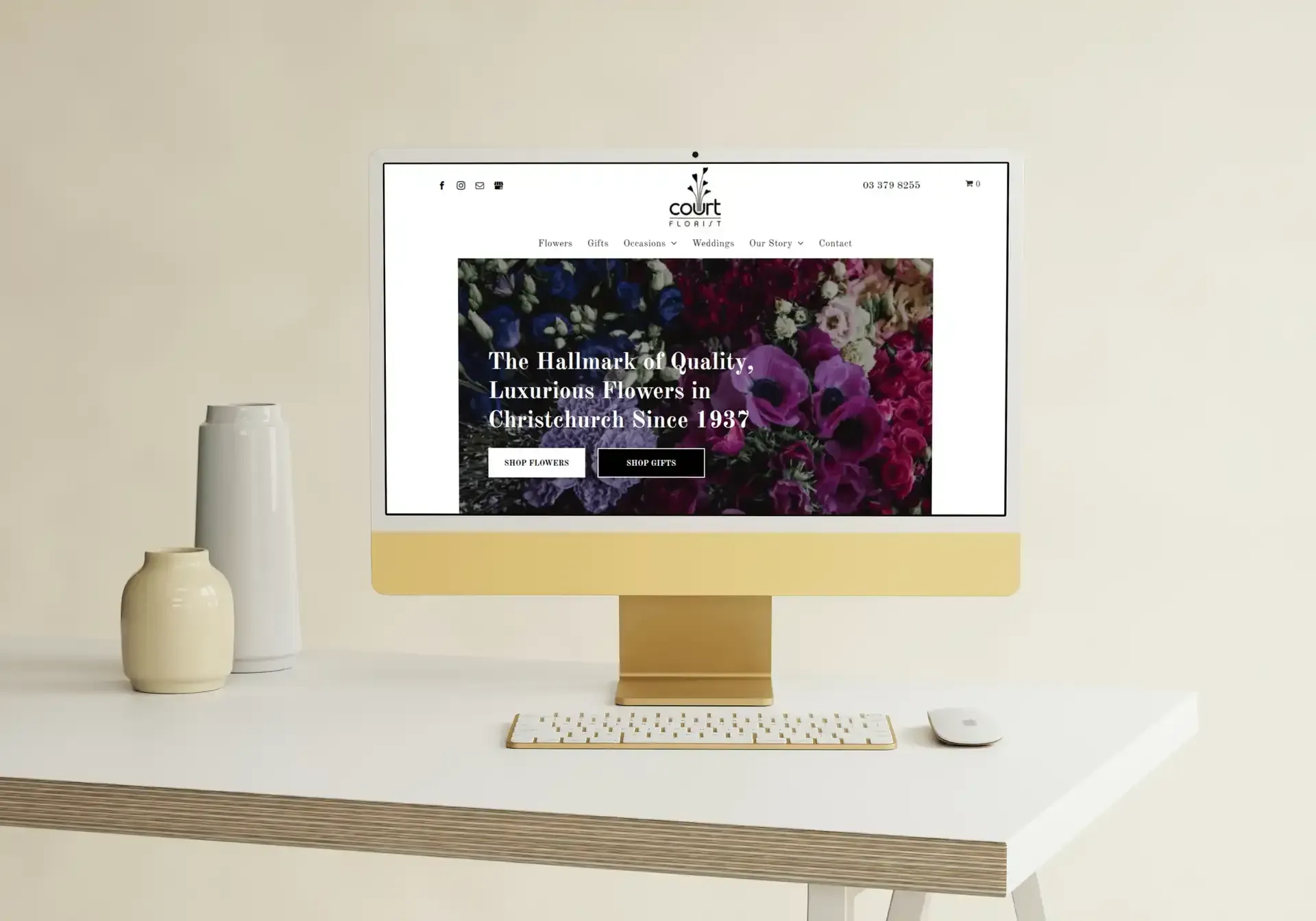
Digital Presence is a web design company Christchurch based but serving New Zealand. We help businesses thrive online through effective yet beautiful website designs - and we are unsurprisingly big fans of white space. By using white space strategically, we create a website that is both visually appealing and supremely user-friendly. Supremely user-friendly? That’s a big thumbs up for SEO purposes too. 


Example of white space web design presented on an Apple Imac

What is white space?

White space is everything from the distance between lines to the letter spacing and the space encompassing text and images. It’s the fuel of a website’s flow and enables seamless navigation.


Too much white space and the website design feels empty and causes a sense of disconnect with the reader; too little and the page feels cluttered and unprofessional. The correct use of white space increases the page’s readability by 20%.


The benefits of white space in website design


  • Enhances visual appeal: have you ever visited a luxury brand’s website? The generous use of white space alludes to sophistication, elegance and minimalist luxe. White space instils a sense of professionalism and trustworthiness.


  • Enhances readability: tightly spaced text turns readers off, and too far apart you risk the reader’s interest going elsewhere. Visitors crave easy to digest content.


  • Creates a sense of balance: allows the content room to breathe without overwhelming the visitor. Arguably, white space is as important as the content – a visual cue to support the hierarchy of content information.


  • Helps to organise content: the law of proximity helps the reader to understand the relationship between elements. Close together and they are perceived as being related and those at a distance interpreted as being different.


  • Focuses attention on key elements: a cluttered website dilutes the power of the core message. White space removes distractions and brings the reader’s eyes to the important element.


Website designers love white space, yet oftentimes web masters want the space filled – for every pixel to be used. However, this is a false economy, sometimes less is more and white space is not wasted space. White space underpins the best website designs – enjoyable to use, easy to interact with and easy on the eye.


Contact Digital Presence for a free no-obligation chat about your brand’s current online representation, and how we can breathe new life into it though our tailored web design services (Christchurch based but serving the rest of New Zealand too). Call 0274 278047.


Get a free consultation

Share

A keyboard with a wheelchair ear and blind person buttons
by Fay Roe 29 April 2025
An accessible website isn't just a nice-to-have feature - it's essential. At Digital Presence in Christchurch, we believe that designing websites with accessibility in mind creates better experiences for all users, regardless of their abilities. When your website is accessible, you're not only complying with guidelines and regulations but also expanding your reach to a wider audience. Why accessibility matters for your business Did you know that approximately 15% of the global population lives with some form of disability? That's over a billion potential customers who might struggle to use your website if it's not designed with accessibility in mind. Aside from the ethical considerations, accessible web design offers tangible business benefits: Broader audience reach : an accessible website design can be used by everyone, including people with visual, auditory, neurological, and physical impairments. Improved SEO : many accessibility practices align perfectly with SEO best practices, helping your website organically rank higher in search results. Enhanced user experience : features that help users with disabilities often make the experience better for everyone. Legal compliance : many countries already have laws requiring websites to be accessible, so making your website design accessible now reduces the risk of future compliance issues. 7 Accessibility best practices that benefit all users As a leading web design agency in Christchurch, we integrate accessibility into every project we undertake. Let's explore how you can do the same. 1. Optimise colour contrast for better readability Poor colour contrast makes content difficult to read for users with visual impairments, but it affects everyone, especially in challenging lighting conditions like bright sunlight. For example, a contrast ratio of at least 4.5:1 for normal text and 3:1 for large text is recommended. While black text on a white background provides excellent contrast (21:1), using slightly softer combinations reduces eye strain for all users. 
A person is holding a red and white magnet in their hand.
by Simon Mullinger 2 April 2025
Master the art of designing a website for lead generation. Boost your service-based business with a user-friendly, conversion-focused design strategy.
A woman is using a laptop computer and holding a sign that says seo.
by Simon Mullinger 2 April 2025
Boost your local search rankings with website design. Learn key strategies like mobile optimisation, structured data, and user-friendly layouts.
A city tour trolley is parked in front of a building.
by Simon Mullinger 2 April 2025
Learn how to leverage Google Ads to effectively attract local customers in Christchurch, boost your visibility, and drive sales with targeted campaigns.
A computer monitor with a rocket flying out of it.
by Fay Roe 1 April 2025
Get expert insights on launching a new website design. Follow best practices to maintain SEO rankings, improve performance, and engage your audience.
Mobile responsive websites image
by Simon Mullinger 27 March 2025
It's important to know how well each page performs because it helps you to identify which content needs to be improved, updated or even removed. Read more!
A laptop computer is sitting on a desk next to a vase of flowers.
by Simon Mullinger 27 March 2025
Discover your dream website design with our free homepage mock-up service. See your ideas come to life without any commitment. Get started today!
A man is sitting in front of a laptop computer covering his face with his hands.
by Fay Roe 3 March 2025
Click happens! These 7 web design mistakes could be driving customers away. Learn how to optimise your site for better user experience & sales.
A red , yellow , and green smiley face on a blue background.
by Fay Roe 20 February 2025
Outdated web design can hurt your business. Learn how modern, pixel-perfect design enhances user experience, SEO, and conversions. Contact us now!
A tablet with the year 2025 on it is surrounded by paint brushes and paint.
by Fay Roe 6 January 2025
Redesign your website in 2025 to reboot your business. Achieve a fresh, modern look that drives growth for your business. Visit us to engages your audience.
Show More